


Show Me A Sign
March 18, 2019
Signs.
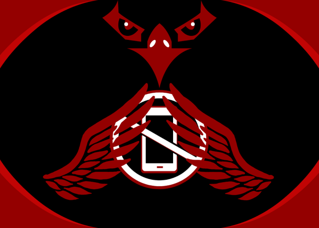
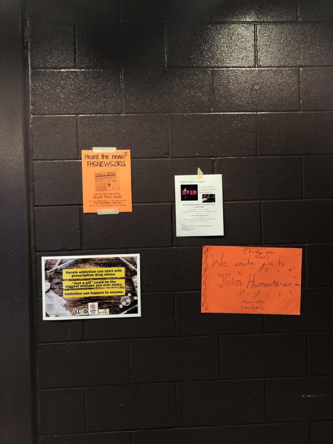
That probably didn’t catch your attention in the slightest, but what if I were to tell you there was a psychology behind the way signs are structured to make you look at them? In an article by Philosophy Communication, it explains the color theory. Now to put it simply, color theory is about the use of colors to make you feel something. An example is how many fast food restaurants have red signs. While the color red is based off of anger or excitement, it can also make people hungry. Now, how does that affect the signs at this school? Well, it really doesn’t. Most of the signs in the school are based off of just looking pretty and standing out. That does not mean they are bad signs, because a good sign should stand out. However, using the color theory could definitely help.
There is another factor that also helps when designing a sign, and that is the font. While font is a major part of making signs, fancy fonts aren’t always the answer, especially for taglines. So, out of all the signs in the school, which ones stand out the most to you? The ones with bright colors? Fancy fonts? What really catches your eye when it comes to walking down the hallway?
When asking the yearbook advisor, Ms. Halliwell, what she thinks makes posters stand out, she said,”I notice the ones that are bright and the ones that are different sizes and shapes.” So the shape of the poster could also be a factor for some people. There could be a lot more factors in which make posters pop out for people, but the key factors are definitely font and color.
If you have a moment, please feel free to take this anonymous poll , it’s a simple short answer poll about what makes posters stand out for you, so I can return to this topic on another date. Thank you for your cooperation.